HotelTonight
How do we to provide confidence in the reliability & value when booking a hotel room at the last minute?
2016
User Experience Design, User Research, User Interface Design, Usability Testing, Prototyping on iOS.
Fellow UX designer Zach Aaronson and I worked on this project with the given brief of creating or modifing certain features derived from user research as well as improving the overall experience. HotelTonight needed to increase the number of rooms it sells. Breaking down this problem, it is believed that people who have downloaded the app forget about it when they plan their trip or believe that people lack confidence that they’ll be able to find something desirable at the last minute. Zach and I knew that these beliefs must be tested to find out if they were true.
RESEARCH
Why use HotelTonight?
We started researching HotelTonight through their website, their mobile site (which is a separate experience), their social media & conducting a heuristic evaluation of their iOS app. The first line in their “About” section on their website best defines quite well what we saw as the primary focus,
“We built HotelTonight because we believe in a life less planned.”
-
User Flow Analysis
& Comparison -
Heuristic Evaluation
& Feature Analysis
Findings
- Quick & easy user flow for finding and booking a hotel room within 7 days.
- Mobile oriented service and use case scenerios.
- Hotel results with an emphasis on photography and glanceable information are the first thing people see when starting the app.
- Complimentary input gestures provides easier navigation.
What are people doing?
We then created a survey asking people questions on subjects such as travel planning, mobile app usage, what information is important to them and about their past hotel and traveling expereinces. Out of 65 participants, 33 were target users who booked a hotel via website or an app. Some interesting findings;
- Only 2/33 of users had booked with HotelTonight.
- Room price & location was the most important information when selecting a hotel.
- Most would ideally plan more than a month in advanced for a trip. However, significant amount of people have had to book a hotel within 24 hours.
Have you ever booked a hotel within 24 hours?
68.7%
Yes
30.3%
No
How far in advance do you book a hotel?
48.5%
A month.
30.3%
More than a month.
15.2%
A week.
6%
Within 24 hours.
Why are people doing this?
From the survey we followed up with 7 participants for interviews, either by phone or in-person, ages ranging from 25–62. We found out a few things.
- People preferred desktop over mobile due to screen size when comparing hotels.
- Users lack confidence in making short notice reservations due to fear of missing valuable deals or desirable locations being unavailable.
- Noted differences in booking behavior between personal & business trips.
Our Focus
The first three features were outlined in the brief, open to be modified. We found that to provide easier and faster decision making process providing contextual and custom recommendations would help. Overall, we wanted to make HotelTonight as reliable and as easy of an experience as requesting an Uber or ordering food from Seamless.
-
View Price Trends
of Desired Hotel -
Custom & Contextual
Recommendations -
Organize Booking
Information -
Ability to
Compare Hotels
DESIGN
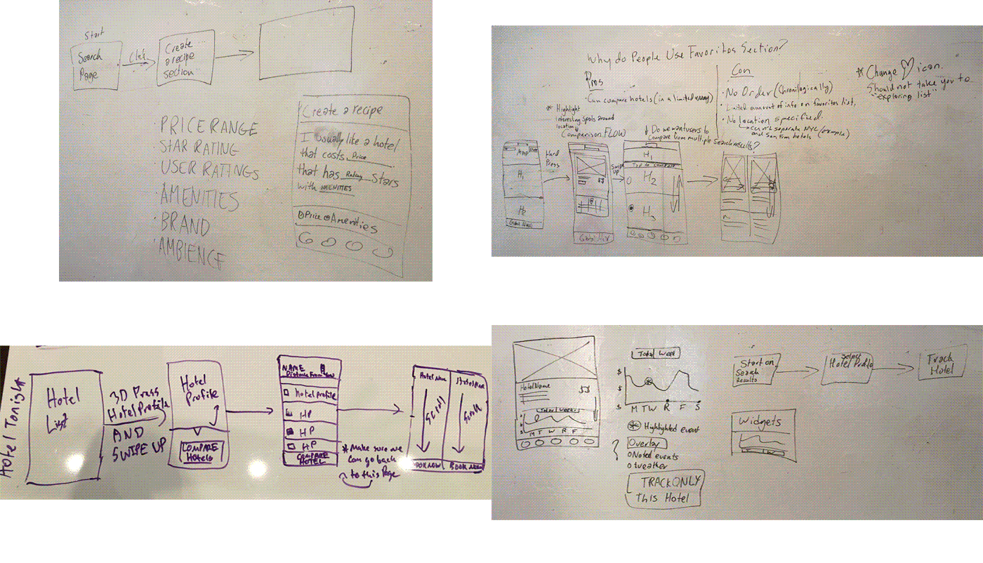
Early Development
-
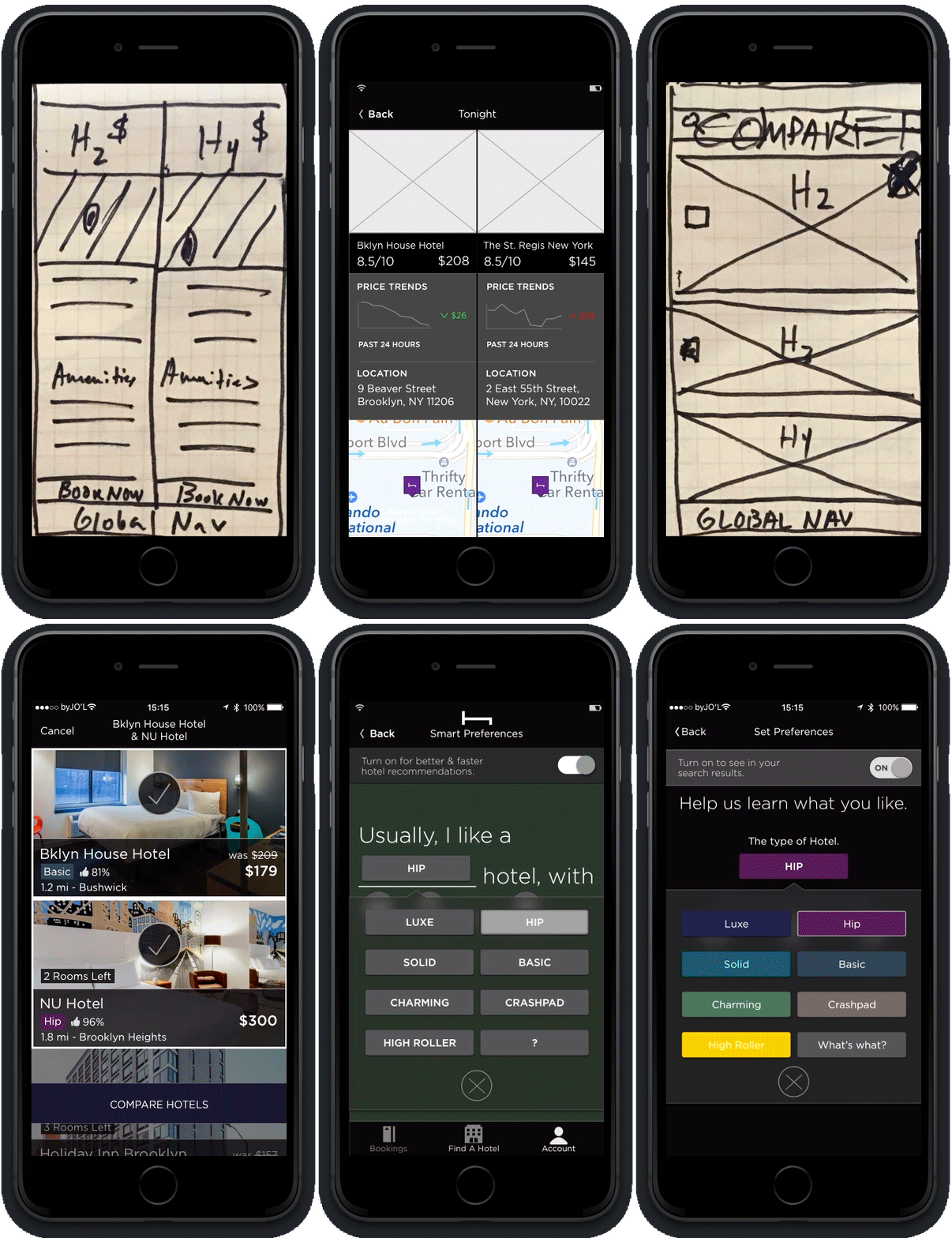
Iterations
-
Comparing Hotels
-

Set Preferences
-

View Price Trends & Bookings
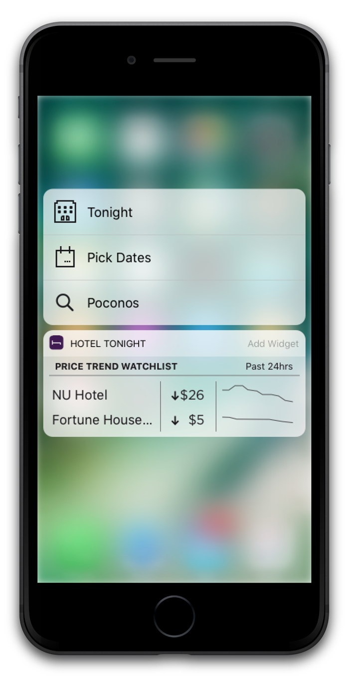
The intention with the widget is to solve two problems; provide as a reminder that the user has HotelTonight on their mobile device and the second was to allow for easier access for viewing a desired hotel’s average room price. This would hopefully encourage people to be more spontanous.
Worked with fellow UX designer Zach Aaronson on user research, testing, design, prototyping & iteration. This project was done during the User Experience Design Immersive program at General Assembly and was not commissioned by HotelTonight.